Before and After Gazebo Photo
Learning to Write left me a comment asking about specifics on what sort of enhancements I made on those photos yesterday. I’ve actually been thinking about doing a little before and after with the occasional photo so the comment really spurred me to go ahead and give it a shot. Let me know what you think:
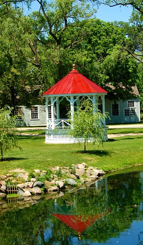
Before:

This was the photo I started with resized from the original but with no other adjustments. A couple of quick notes about what I was thinking. One, it needs to be cropped. I want the gazebo to be the place your eye goes to immediately and be the dominant structure, and I want the red of the roof to stand out more than it does in the bright midday sun. So I cropped a bit off the bottom, and on the right I cropped it so that the brown building is out completely. That leaves me with the gazebo closer to the center, with a gray building behind it, which is similar enough to the gazebo to not distract the eye from the gazebo.
Secondly, I used the auto color enhance setting of Gimp to get to a decent baseline color. That helped brighten the red a bit, both in the roof and the reflection of the pool. Once I had that “baseline” if you will, I then went into the hue and saturation adjustments and simply played a round a little until I got to something that made me happy. I opted for very subtle changes there, again, it was a bright day, I didn’t need to do much to make the colors brighter, but I did want to tone down the green so that the red showed up a bit more. In this case, I did that by changing the hue toward yellow ever so slightly, which made red stand out against the green more. You might make a different choice there. That’s the beauty of digital photography!
One other note. The “aged” baseball photo was actually pretty simple. Gimp has a Script-Fu option to render as an old photo. That script blurs the photo, converts it to sepia, adds noise and adds the frayed border among other things. I actually ran that script once, then cropped the photo, which resulted in part of the photo not having the border, so I ran it a second time. After that I also took the extra step of toning down the brightness and contrast, again using a trial and error approach until I was happy with the result.
Again, I didn’t have to put in a lot of work to get something that I was happy with, you could certainly put in more and experiment with other options in Gimp or your photo editor of choice and come up with something very different than what I have done.
Follow these topics: Photography


Great info! Thanks for the write up. I am traveling this weekend and taking the digital camera along. I’ll take a few shots to play with when I get back.